
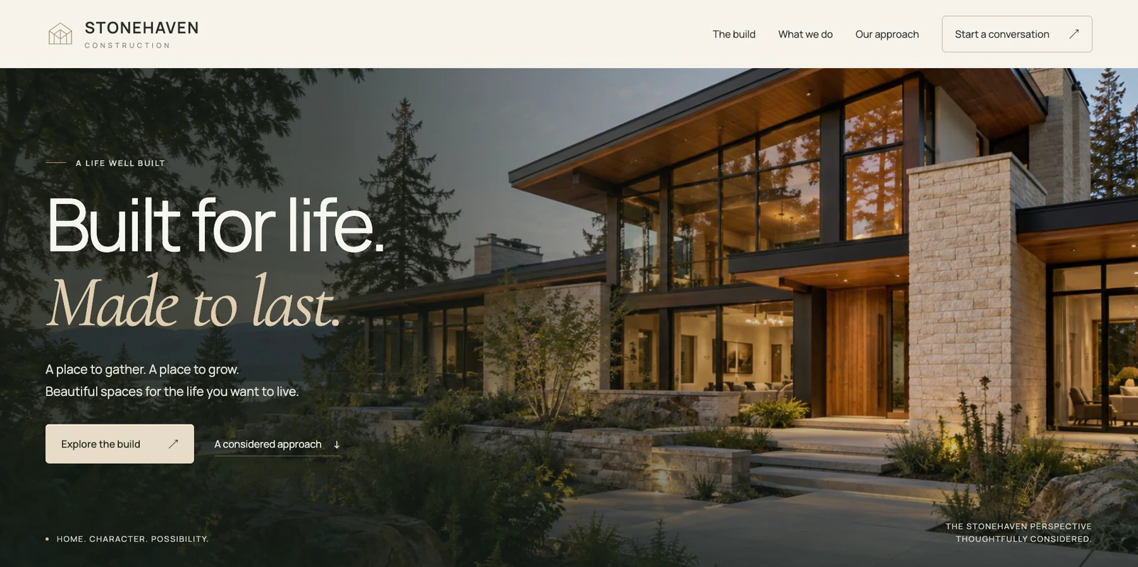
A service-business website has a practical job. It needs to help a person understand what you do, decide whether your business fits their needs, and find the next step. An impressive opening helps, but the pages underneath it need to carry the conversation.
For a Tacoma contractor, that might mean explaining a remodeling specialty and showing relevant work. For a heating and cooling business, it might mean separating repair, maintenance, and installation. For a home-care provider, it might mean helping a family understand the services offered and how an initial conversation works.
Before launching, review the website as a customer making a real decision. The following checklist turns that review into a useful sequence.
Make the business easy to understand
Start with the first screen. Can a visitor identify the business and its main service without reading a long slogan? A creative headline can set the mood, but the supporting sentence should say what the business actually offers.
Be specific enough to guide the right customer. A construction business that focuses on kitchen remodels should make that focus visible. A detail shop should distinguish the work it handles from the broader automotive category. A business with a limited service area should explain that reach accurately.
In the Pacific Northwest, local context can be useful. Tacoma, University Place, and Pierce County are meaningful locations when they reflect your real coverage. Adding every nearby city to a page without a useful reason makes the message harder to read. Start with the areas you actually serve and the questions customers ask about getting service there.
Give important services their own explanation
A short homepage overview helps people choose a direction. A service page explains what that direction involves. It should describe the work, the kind of request it fits, the information a customer should bring, and the next step.
For construction, useful details might include the types of projects accepted and how the initial discussion is arranged. For HVAC, the distinction between an existing-system service request and a planned replacement can make navigation clearer. For auto detailing, the difference between an interior service and a full detail helps people select the right conversation.
The goal is clarity. Avoid promising a service, response time, license, or availability that has not been confirmed by the business. If pricing varies by condition or scope, explain how a quote is established rather than presenting an incomplete number as a universal price.
Show work that answers a customer’s question
Choose photographs and project descriptions together. An image can show finish, atmosphere, or attention to detail; the accompanying description explains what the visitor should notice.
Useful project content can describe the starting point, the visual direction, the audience, and the choices behind the layout. It does not need an invented sales result. If you have measured an outcome, explain what was measured and over what period. If you have not, keep the description focused on the work you can show.
Use your own work or imagery you have permission to publish. Make demonstration projects clear on their detail pages. When a client approves a testimonial, preserve the meaning of their actual words and identify the source appropriately. A designer’s analysis of a website is useful too, when it is clearly presented as analysis.
Check the contact path from a phone
Open the site at a narrow width and try the next step. Can you find the phone number? Does a call link use the correct number? Can you complete the form without zooming into tiny text or hunting for a hidden button?
Look at the form’s questions as well as its appearance. An initial project inquiry usually needs a name, a reliable reply address, and a short description of the work. Optional details should be clearly marked. Asking for everything at once can turn a simple introduction into an unnecessary chore.
A submission should have a clear result. A saved inquiry receipt gives the visitor something useful to keep. Behind that result, the business needs a dependable destination for the inquiry. Test the entire route, including the private record or inbox that the team will actually check. A working-looking button alone does not establish delivery.
Review readability and navigation
Read each page without relying on the pictures. The main heading should identify the topic, and smaller headings should divide the explanation into useful sections. Links should describe where they lead.
Check the pages from the main menu and the footer. A visitor should not need to scroll through the entire homepage to discover that service pages exist. A simple services directory can make the available choices easier to compare, while individual pages provide the detail.
Keyboard navigation is a useful extra check. Move through the menu, links, and form controls with the keyboard and watch where focus goes. The visible order should make sense, and the focused control should remain visible. For a full accessibility evaluation, use the relevant standards and a deliberate testing process rather than assuming that a few successful taps establish compliance.
Confirm the launch details
Before publishing, compare the contact information on the homepage, service pages, footer, and business profiles. Check the page titles, descriptions, and canonical URLs. Confirm that the site is available at the intended domain and that missing pages return a real not-found response.
Decide who will own the source files, domain, hosting account, and form records. Record how a future update will be published and how the previous release can be recovered. Those practical details matter when the first round of design is finished and the business needs an ordinary change.
Finally, make a list of what needs maintenance: service information, photographs, contact hours, team details, and articles. A site can start with a focused set of useful pages and grow as the business develops. Depth comes from answering real questions clearly, not from stretching every page to an arbitrary word count.
Bring the right material to your designer
Prepare your current services, service area, contact information, logo, approved photographs, and any existing website address. Add a few examples of visual styles you like and a list of the questions customers ask most often.
Those materials give a designer something concrete to work around. At Umanifest, the first step is to understand that direction, then shape the page structure, visual presentation, and contact route together. Explore our custom web design approach or share your project when you are ready to discuss the next step.
Sources & further reading
- Google: creating helpful, reliable, people-first content
- Google: SEO starter guide
- W3C: accessibility principles
Published by Umanifest with AI-assisted research and writing. External standards and tools can change; sources are provided so you can check the current guidance.