
An original Umanifest exploration for a fictional brand. The imagery is illustrative, and the story describes a possible website approach.
- Focus
- Homes & interiors
- Project type
- Fictional brand exploration
An exploration of a quieter kind of confidence.
Northline begins with a design question: how can a homes or interiors website feel welcoming while giving its work a strong presence? The brand is imagined, so the exercise focuses on composition and communication. It does not represent a commissioned renovation business, completed building projects, or reported customer results.
That distinction gives the exploration a useful purpose. A prospective business owner can look at the tone, page order, and relationship between words and photography, then discuss how those choices might translate to their own services. The demonstration supplies a visual direction; a real project would supply its own identity, information, and work.
Let the materials and the type share the story.
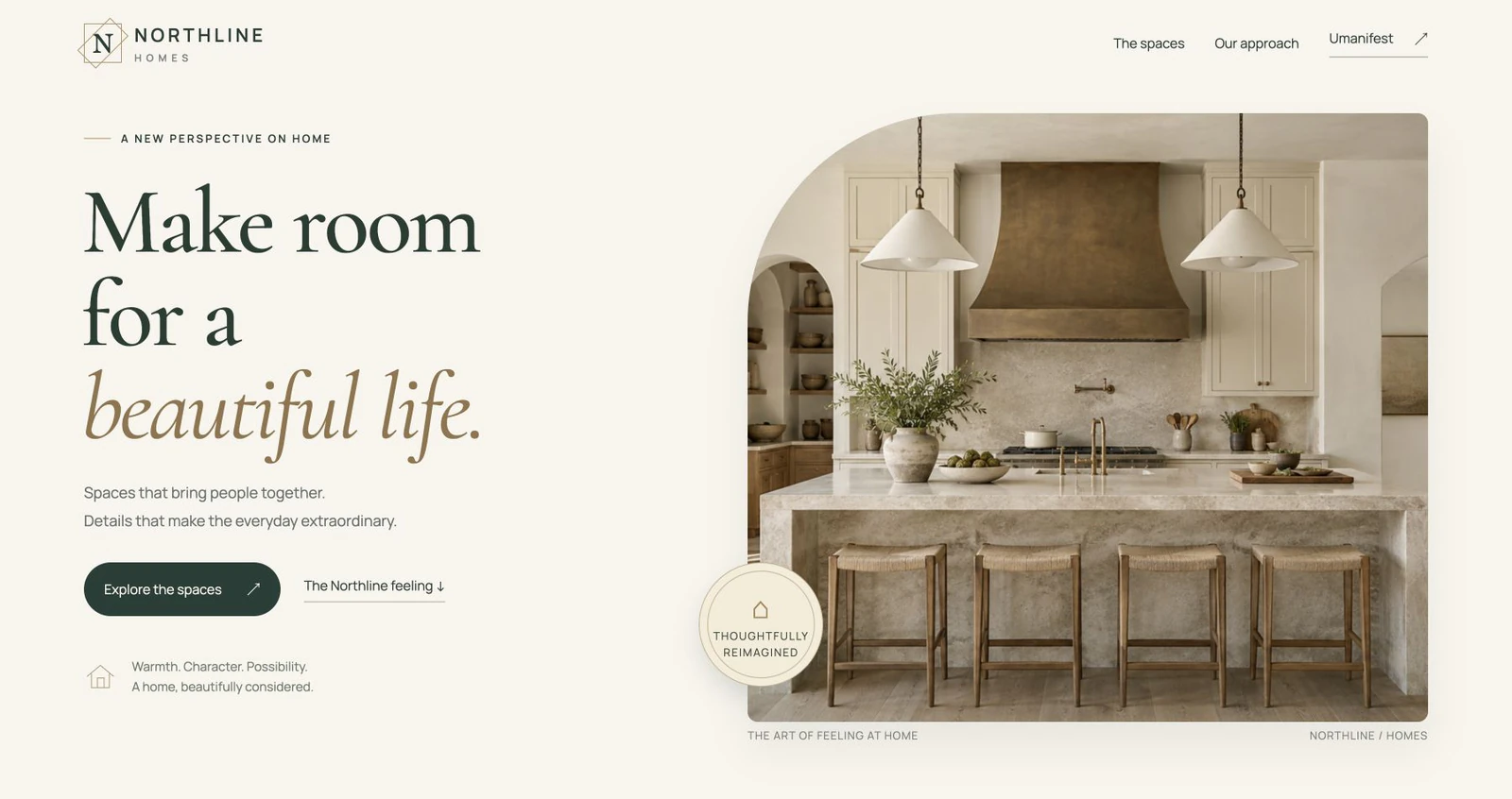
The opening combines warm ivory, restrained dark lettering, and a large arched photograph. The shape gives the image a memorable frame without placing several competing elements around it. Serif and sans-serif typography create a deliberate contrast between expressive headings and straightforward supporting information.
The kitchen and living-space images were created as original illustrations for this demonstration. Light stone, plaster, bronze, and oak establish the mood. They are not photographs of Northline commissions. Their role is to help explore how a coherent set of visual materials can make a website feel like one considered place.
Move from atmosphere into understanding.
A beautiful opening earns attention, but the next sections need to explain the business behind a real website. The Northline composition moves into an introduction, a small selection of visual studies, and an approach section. That sequence shows one way to develop a story rather than ask a gallery to communicate everything on its own.
For an actual interiors business, each project story could explain the brief, the work handled, and the details worth noticing. Service information and the route to an inquiry would then help a visitor decide whether the business fits their needs. Those facts would come from the owner, not from this imagined brand.
Preserve the feeling on a smaller screen.
The phone layout needs its own composition. A wide photograph can lose the important part of a room when it is cropped into a narrow frame, while an oversized heading can become several awkward lines. Image position, headline breaks, and the order of supporting text all contribute to the smaller-screen experience.
Northline uses responsive layouts and readable text around the imagery. The intention is to keep the same visual language while allowing the content to move naturally. On a client website, the mobile review would also include the real navigation, customer questions, and inquiry route that belong to that business.
Careful details support the visual impression.
The demonstration includes internal navigation and restrained movement. Its content remains visible when reduced motion is preferred. Focus visibility and descriptive image text are part of making the page understandable beyond the initial photograph, and should be reviewed alongside the finished copy and controls.
The portfolio preview uses responsive local image files sized for the layout. Image dimensions reserve space while it loads. Those practical choices support the visual rhythm as the page appears. A finished business site would also be reviewed with its actual navigation, content, and customer actions, giving the details the same attention as the opening photograph.
Use the direction as a starting point.
Northline demonstrates how an interiors website can have depth and personality without filling every space with a card or a competing message. Its strongest idea is the connection between the opening image, the typography, and the calmer story that follows.
A similar project would begin with the owner’s services, photographs, audience, and preferred customer action. The design could then keep the qualities that resonate while developing a distinct identity. Northline provides a starting point for that conversation, showing how an expressive opening can continue into a calm and useful website story.
TAKE A CLOSER LOOK
Explore the demonstration.
The full example lets you explore its composition and interactions. Your own website would use your business information, content, and customer process.