
- Focus
- Handcrafted retail & ecommerce
- Project type
- Existing client website
Keep the personality that makes the work recognizable.
A handmade store has something a generic product grid cannot supply: the character of the objects and the person behind them. The Wired by Wiggins refresh worked with that identity. The documented brief called for a more modern, visually appealing storefront that would also be useful when people encountered the business in person.
The work included presentation, product organization, supporting copy, and responsive refinement within the existing Wix Studio site. The native store remained the foundation for the catalogue and customer journey. The refresh connected those existing systems with a more coherent visual direction and more useful information about the products.
A strong photograph gives the opening its center.
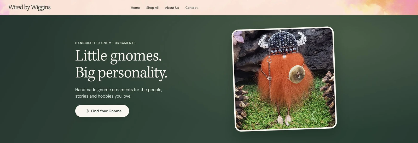
The captured homepage uses a deep forest-green field, an ivory headline, and a large Viking gnome photograph. The image brings material, texture, and character into the first view. The headline and shop action have their own space, so the customer can understand the offering without several promotions competing for attention.
The documented design also uses a warm ivory surface and DM Sans for body text. The owner’s preferred falling-leaves header animation was retained. Its presence belongs to the store’s personality; the surrounding layout gives the words and product image enough clarity to remain the main point of the opening.
Make browsing reflect the actual collection.
Product organization was a concrete part of the refresh. The verified collection structure includes Mini Gnomes, Magic & Folklore, and Hobbies & Characters. A featured collection was named Featured Gnomes instead of using an unsupported sales-ranking label. Empty or unverified promotional collections were hidden.
The visible product descriptions were rewritten with character-specific copy, while existing product URLs, prices, inventory, and visibility were preserved. That work supports a simple journey: recognize the handmade offering, choose a relevant theme, and understand an individual piece. The catalogue details and the visual presentation can then tell the same story.
Give phone visitors a usable storefront.
The owner specifically wanted tight, attractive mobile layouts and readable text instead of narrow, stretched columns. The recorded review included desktop, tablet, and phone-width browser checks. Product imagery, page spacing, and supporting policy text were considered together rather than treating the mobile site as a smaller screenshot.
For a shop, readability extends beyond the hero. Collection labels, descriptions, and customer-support information all influence whether someone can keep browsing with confidence. The documented work refined those areas, with the existing store system retained. An actual hardware iPhone or Safari verification is not claimed in this case study.
The supporting pages belong to the experience.
The refresh included business-centered policy and FAQ copy, clearer formatting, descriptive image text, and a corrected email contact link. The newsletter wording and existing consent were retained and refined. No test subscription was submitted as part of that recorded work.
The entrance motion was later implemented through supported CSS classes, with reduced-motion behavior preserved. Motion, readable content, visible navigation, and correct destinations need to work together. Those considerations keep the decorative character connected to the practical storefront, giving customers room to enjoy the products while finding useful information.
A storefront can feel personal and stay organized.
Wired by Wiggins shows how a refresh can build on an existing business identity. The green direction, real product photographs, thematic browsing, and more specific copy connect the visual impression with the handmade collection itself.
For a similar project, the starting point would be the actual catalogue, brand materials, customer questions, and systems already in use. That information can guide the design without inventing promotional claims or changing commercial details merely to fill a layout. The public website remains the place to see the store’s current offering.
TAKE A CLOSER LOOK
See the existing website.
The business’s public website shows its current presentation. Services, products, and commercial information remain under that business’s control.