
An original Umanifest exploration for a fictional brand. The imagery is illustrative, and the story describes a possible website approach.
- Focus
- Heating & cooling
- Project type
- Fictional brand exploration
Comfort is a feeling and an information need.
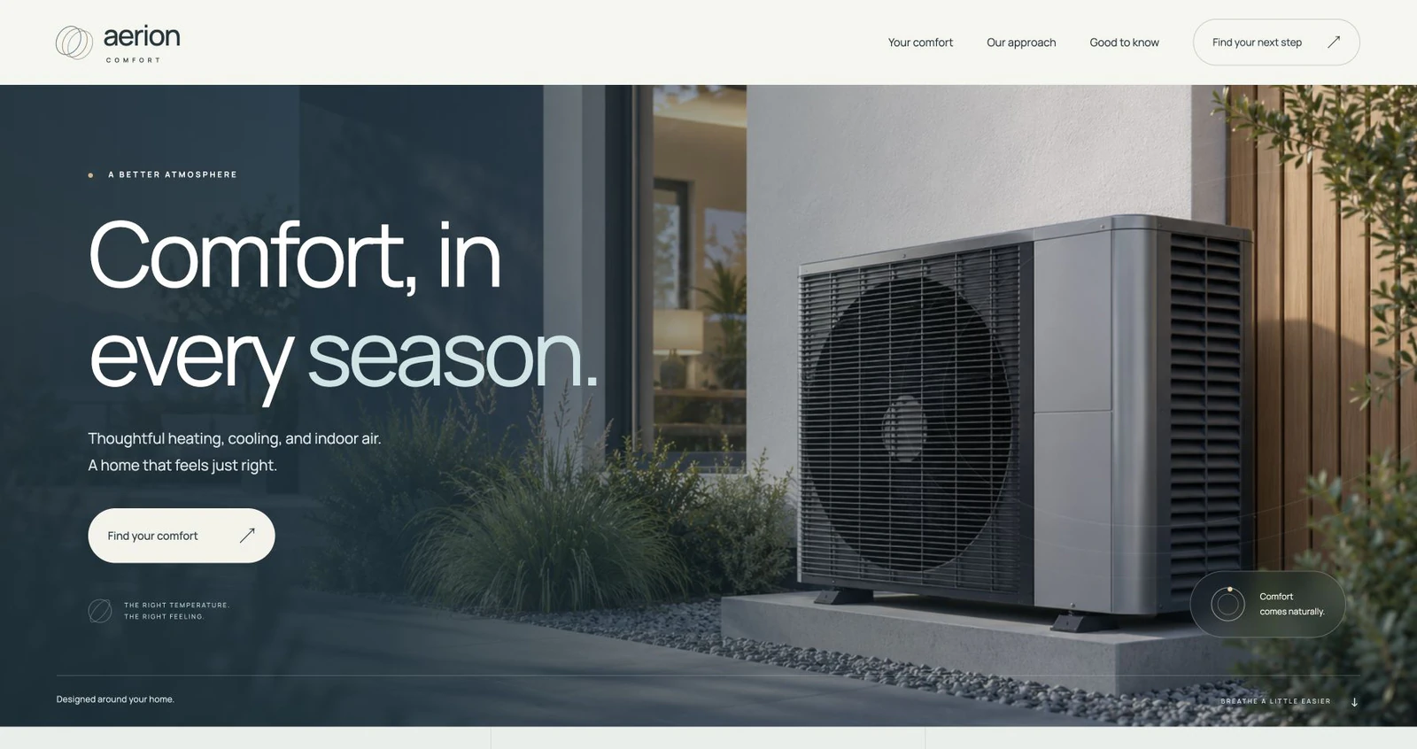
Aerion approaches an HVAC website through the idea of home comfort. The name and business are fictional, so the demonstration explores a possible design direction rather than presenting a real service company. Its original image establishes a setting for the composition, not evidence of an installation or a customer home.
The useful question is how a heating and cooling website can communicate clearly to people arriving for different reasons. Some visitors may be researching a future installation. Others may want to find a relevant service contact. A real website needs to organize those needs around the services and processes the business actually provides.
A calm identity can still have presence.
The demonstration combines a restrained blue-green direction with light surfaces, generous space, and a clear hierarchy. Its visual tone suggests a considered home environment. The imagery and type work together so the opening has personality without crowding the service information.
That balance matters for a practical business website. A strong headline can introduce the brand, while shorter supporting copy establishes the page’s purpose. Color and spacing then help distinguish the next parts of the story. In a client brief, the final direction would respond to that company’s own brand, photographs, and service audience.
Give different customer questions a useful route.
An HVAC service list becomes more helpful when visitors understand the distinctions within it. Heating, cooling, installation, and maintenance can require different explanations when those services belong to a real business. The site structure should help a customer find the relevant information instead of presenting every option as the same message.
The Aerion exploration uses service and approach content to develop the opening into a fuller page. For a commissioned website, hours, coverage area, service categories, and the way an inquiry is handled would be confirmed with the owner. Those operational facts are important design inputs, not details to invent for a finished-looking layout.
Keep useful information within reach.
The phone experience should let someone read the service information and understand the next step. Headings need room to wrap, supporting text needs a comfortable measure, and menus need clear controls. A wide hero image also needs a crop that still communicates its intended setting.
Aerion has a responsive demonstration layout and a working mobile menu. A real HVAC project would go further by checking the actual business contact routes and any scheduling system. The menu and visual layout are part of the design exploration; service availability and customer response would remain real business decisions.
Review usability alongside the visual direction.
Readable text, descriptive images, visible focus, and navigation that can be used with a keyboard are useful review points for a service website. Decorative movement should also allow people to read comfortably. The demonstration preserves visible content when reduced motion is preferred.
The portfolio and example use local fonts and responsive imagery, keeping the presentation tied to known assets. Reserving image space and choosing appropriate image sizes help the layout remain orderly as content loads. These considerations describe the approach; they are not a measured loading-time result or a certification of a future client website.
Let the design make practical information feel approachable.
Aerion shows a possible alternative to a crowded service page: a calm visual direction with enough structure to explain the business. The point is to keep the feeling of the brand connected to the questions a customer needs answered.
A comparable project would begin with the actual service list, contact process, service area, and any existing customer tools. Those details would then guide the layout and wording. Aerion is a conversation starter for that work, showing how a calm identity can support a service structure that stays useful as the page develops.
TAKE A CLOSER LOOK
Explore the demonstration.
The full example lets you explore its composition and interactions. Your own website would use your business information, content, and customer process.